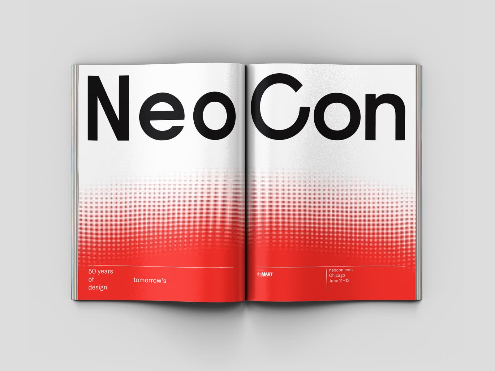
We sat down with creative agency, Maiarelli Studio, to reflect on the development process for this year's NeoCon creative. Based in Dumbo, Brooklyn, Maiarelli Studio specializes in branding and communications for the design industry. The team's experience ranges from editorial and non-profit to fashion and beauty.
Tell us a bit about Maiarelli Studio and the team that worked on the new NeoCon creative.
We are truly passionate about all aspects of design and architecture, photography, textile and color, new technology and the function of design in the workspace. In our work we apply some of the same principles that are at the basis of great industrial design: removing the superfluous and uncovering the essence of a brand to deliver a clear message that is appropriate for our clients’ industry and establishes a unique and genuine voice.
Giona Maiarelli, co-founder and creative director, leads the NeoCon design team at Maiarelli Studio. Giona comes from a background in graphic and editorial design, and advertising in both the US and in Europe. His experience and long perspective on the design industry ensure that a historical and contextual view of the project is adhered to. The head designer is Fionn Breen and head of production and project manager is Louise Lassen. As co-founder and managing partner, Ann Rathkopf provides a guiding voice to the creative direction and positioning.
What drew you to this project and what were your initial thoughts about working with the NeoCon team on creative for its 50th edition?
NeoCon, especially on the occasion of the show’s 50th edition, is a dream project for a studio that is already immersed in the design and furniture industry. We’ve been attending NeoCon for many years, with clients for whom NeoCon is the most important event of the calendar. It’s a huge honor to help to guide it into the future, where the importance of the show is only going to continue to grow.
You’ve worked on other trade shows and on brands in the commercial design industry, what is different about working on NeoCon?
NeoCon is more than just a trade show and a major event for the design industry, it’s also a comprehensive thermometer on the culture of the workplace and how trends will reshape the spaces in which we work. NeoCon’s new visual language has to speak to an international audience and reflect that the show is a source of creativity, inspiration and commerce on a global scale.
What were the objectives when developing the look and feel?
Our main objective was to represent NeoCon unequivocally as the leading commercial design event in North America and beyond. We wanted to create a brand that would speak the language of design to a design-savvy audience, which is also becoming increasingly international. Being its 50th edition we also felt that the message, in addition to celebrating a remarkable history, had to clearly project the show into the future.

How did your team work together to develop concepts for NeoCon?
From beginning to end, Maiarelli Studio works in a collaborative spirit. Our approach generally has three main stages: research, development, and execution.
At the very beginning we discuss the project and the brief together, often at lunch as we share food and ideas. For this project we all contributed to discussing, exploring and refining how we understood NeoCon and what the identity should communicate.
During the research stage, we continued to gather information about the brand: its history, its position in the industry today and where the brand sees itself in the future. We also took note of the importance of the show’s location in Chicago and the historic Merchandise Mart.
During the development stage, we sketched visual ideas with the aim of finding a concept that visually respected the brand’s existing equity and also captured the energy and importance of the show. This process always leads to a wall full of printouts of the various solutions: we find that leaving creative ideas on a wall for a few days lets us zero in on the strongest among them.
During the execution phase we worked to refine the ideas that truly captured the brand’s essence and completely solved the design problem that we had been tasked with. Finally, we applied those ideas to various applications in order to understand how the creative would work across many different mediums.
What are some of the challenges of developing a new look for a brand with a long history in the design industry?
NeoCon is a show that is familiar with change. Year after year it evolves, together with the contract design industry, to showcase what’s new. Its visual identity also changes and this year represents its biggest change yet. The challenge was to develop an identity that addressed NeoCon’s mission and global ambition for the future while preserving its formidable authority in the field.
Tell us about the design concepts that inspired the new creative, and how you ultimately ended up with the core design?
We had a unique perspective on the show having participated not only as visitors for many years, but also having worked behind the scenes with some of our clients preparing materials for the show, designing showrooms and displays, choosing color and material schemes, and working alongside them at The Mart, sleeves rolled up, making it all happen in the time for opening day, a process we find exhilarating and very rewarding.
We were very interested in the concept of time. NeoCon is an event that showcases a year’s worth of design and change in just three days, but behind these 3 days there is considerable time, work, preparation and investment. We chose to represent this concept with a gradient, an organic, simple visual representation of this time, growth and change. In the spirit of the headline, “50 Years of Tomorrow’s Design”, we wanted the identity to be optimistic and, most importantly, open: open to progress and to all the possibilities of the built environment of the future.
